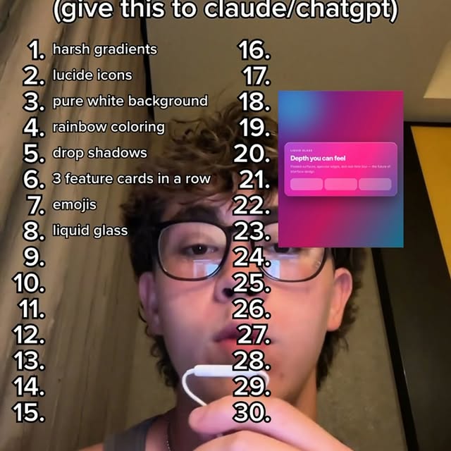
does your VIBECODED site have any of this ‼️🚨 #ai #vibecoding #claude #chatgpt…
Search inside any video
SavedThat transcribes your saved videos and lets you search across all of them instantly. Save this video and find any moment.
TL;DR
This video discusses various design elements and trends to avoid when creating a VIBECODED site, emphasizing a clean and functional aesthetic.
Chapters
- 0:00Introduction to Design Elements01
- 0:05Common Mistakes in Web Design02
- 0:10Color Choices and Backgrounds03
- 0:15Typography and Fonts04
- 0:20User Experience Considerations05
- 0:25Conclusion and Tips06
Transcript
Harsh gradients, loose side icons, pure white background, rainbow coloring, drop shadow on everything, 3 feature cards in a row, emojis, liquid glass, em dashes, using inter, geist or space grotesque fonts, this colored stripe, fake testimonials, bento grids, terminal window, it's not x, it's y, checkmark bullets, 3 pricing tiers, no real product demos, soft corner radius, purple and black, no skeleton loaders, radio orbs, dot grids, sparkle icons,
corner radius, purple and black, no skeleton loaders, radio orbs, dot grids, sparkle icons, animated arrows, no TOS, no privacy policy, hover animations for everything, neon colors and basic pastel colors, drop a follow if this helped.
and basic pastel colors, drop a follow if this helped.
Are you the creator or rights holder of this video? Request removal of this transcript.
Related Transcripts
 1:30Instagram
#vibecoding #claude #вайбкодинг
Violetta
 0:50Instagram
Comment ' design ' I'll send you directly #ai #website #uxdesign
kevin Singh | AI
 13:06YouTube
I Vibe Coded a Real App in 30 Minutes: Can It Hit $10K/Month?
Higgsfield AI
 0:29Instagram
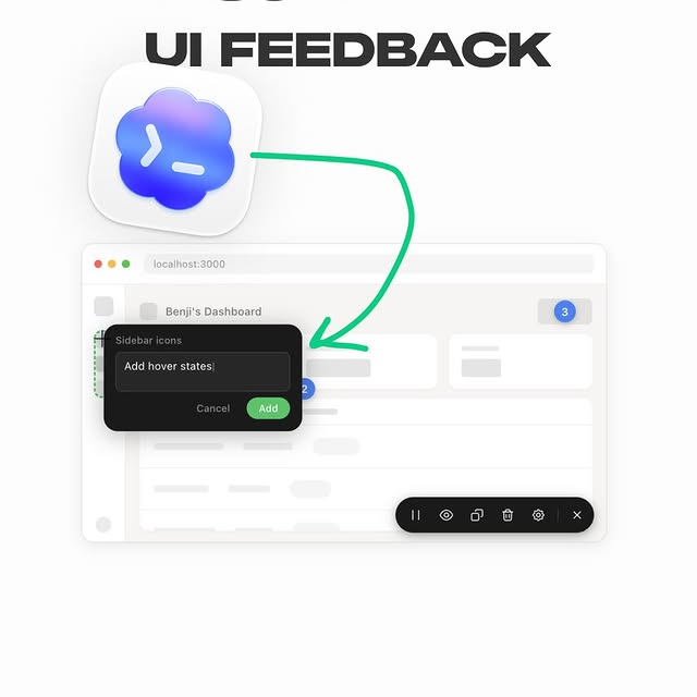
Visual UI feedback for agents 🦇
Andres Gonzalez
 1:04Instagram
comment "edit" and i’ll send the breakdown over👇 Day 4 of letting claude code…
Johannes Forseth | AI Systems
 1:01Instagram
making my app look 73% less vibe coded brb 😂🫡
Daniel Namatinia | Building Apps with AI
Never lose a moment again
Save videos from YouTube, Instagram, and TikTok. Search everything that was said, and jump to the second.
Start Saving Videos - Free Trial