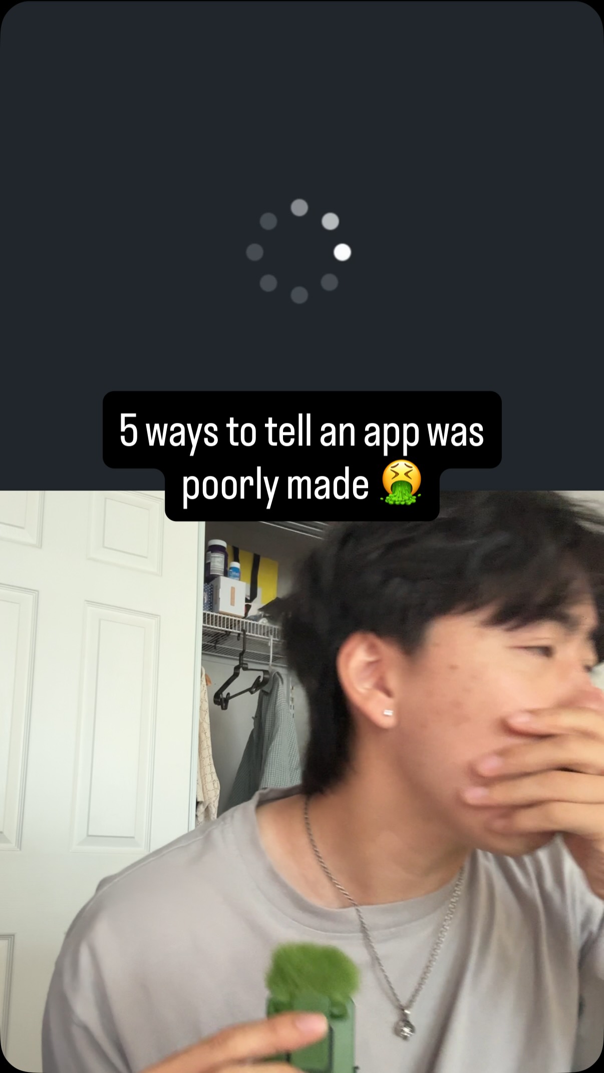
5 things that you should be ashamed to have in your app 🤮🤮 1.
Search inside any video
SavedThat transcribes your saved videos and lets you search across all of them instantly. Save this video and find any moment.
TL;DR
Learn about five critical mistakes to avoid in your app, including design flaws and user experience issues that can damage trust and retention.
Chapters
- 0:00Introduction to app mistakes01
- 0:101. Spinny loaders vs skeleton loaders02
- 0:302. Dark patterns in apps03
- 0:503. Unresponsive buttons04
- 1:104. Inconsistent button positions05
- 1:205. Console errors in apps06
Transcript
Here are five things you should be embarrassed to have in your app. If I see the last one, I'm deleting your shit instantly. Number one, spinny loaders. Why are you not using skeleton loaders instead? Skeleton loaders mock the format of your real components and it looks a hundred times more professional. Number two, if you have any dark patterns in your app. This includes making unsubscribe very
difficult to navigate to, tricking users into paying for your app. Might squeeze a little bit more money from your users, but overall you damage trust significantly and it's not worth it. Number three, unresponsive buttons. If I press a button and there's no instant feedback, then that's bad user experience.
Even if it's loading something that takes a bit more time, you should provide instant feedback in the UI. For example, in my app, when you want to delete a closet item, it takes a bit because there's a lot of records and assets that it needs to clean up. But instead of making the user wait for all that, I just switch the status to hidden instantly and process the rest of the delete
in the background. Number four, inconsistent button positions in your onboarding. Yeah, I was guilty of this at first, too. But your onboarding really needs to be the smooth, really polished experience. Users should be able to press the continue button at the same place in the screen every single time. Any deviations from that I've seen significantly hurts the retention rate.
And number five, if I see any console errors, if I press a button and I get a pop up like a 404 error code, I'm immediately uninstalling your app. Backend and console errors should never surface to users in your app. And to me, that just signals this app was poorly made and you don't care. Instead, these errors should be caught and you should only display more user friendly error messages to the UI.
Keep your logs to yourself. I don't want to see it. And number six, bonus, you should be embarrassed if you're not following me because I'm keeping all the tips and tricks I learned while scaling my app, Chloe, to 10000 users. Let's go.
my app, Chloe, to 10000 users. Let's go.
Are you the creator or rights holder of this video? Request removal of this transcript.
Related Transcripts
 1:01Instagram
making my app look 73% less vibe coded brb 😂🫡
Daniel Namatinia | Building Apps with AI
 1:05Instagram
If you find this useful please like and follow
Ayo O | App Developer
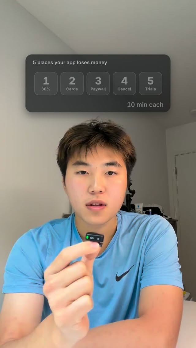 0:58Instagram
5 places your app can lose money.
Colin Tam
 1:06Instagram
My full app launch checklist 👇 1.
Chris Raroque
 0:41Instagram
1) No restore purchases button 2) No terms of service in app description 3)…
Aaryan Gusain
 0:53Instagram
If you find this useful please like, save, and share to your business partner
Ayo O | App Developer
Never lose a moment again
Save videos from YouTube, Instagram, and TikTok. Search everything that was said, and jump to the second.
Start Saving Videos - Free Trial